Table of Content
(503 views)
Last Updated:16 Mar 2026 , 7:55 am

Introduction
In the world of web development, creating responsive designs has become a critical component of modern user interfaces. Whether you’re building a website, an interactive application, or even a game, ensuring that your design adapts seamlessly to various screen sizes is essential for offering a smooth user experience.
One particularly fun and engaging element many developers enjoy building is the slot machine. Not only do slot machines offer users an exciting experience, but they can also provide a challenge in terms of making sure the layout is responsive across multiple devices. If you are working on creating an HTML slot machine for your website or app, you might be wondering how to make your slot machine HTML code responsive for all screen sizes.
This guide will walk you through the process of ensuring your slot machine works well across different devices, including mobile phones, tablets, and desktop computers. By using modern CSS techniques, such as media queries and flexible layouts, you can make sure your slot machine offers an optimal experience, no matter the screen size.
Setting Up Your Basic HTML Slot Machine
Before diving into the responsive aspect, it's essential to set up the basic structure of your HTML slot machine code. A typical HTML slot machine includes elements like reels, buttons, and a display area for showing the outcome of a spin. Here's a simple example of the basic HTML layout:
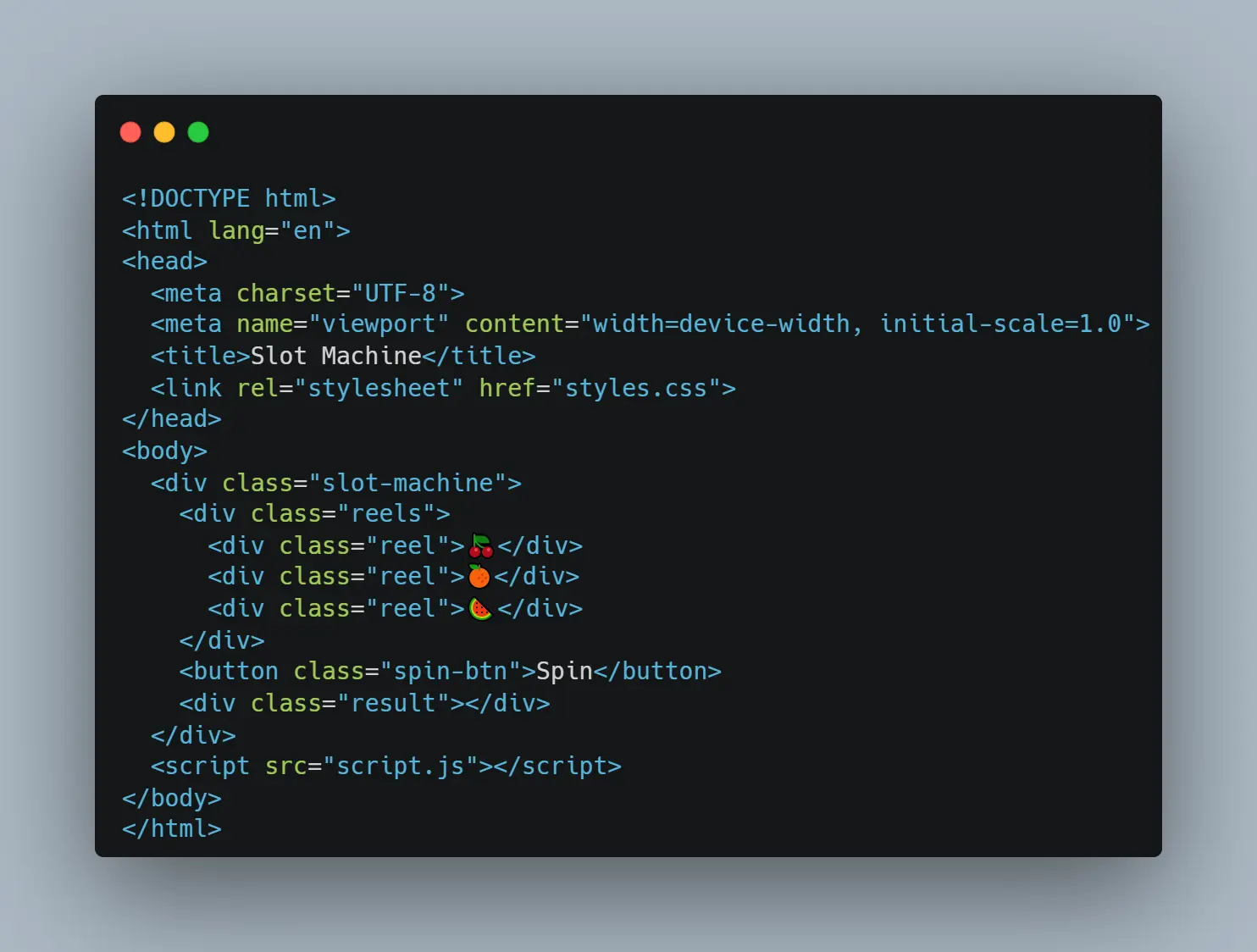
This basic HTML structure consists of:
- A div container with the class .slot-machine to house the entire slot machine.
- A .reels container that holds individual reel elements (representing the symbols, such as 🍒, 🍊, 🍉).
- A Spin button that the user can click to spin the reels.
- A result area to display the outcome of the spin.
In the next section, we will focus on how to make this layout responsive for different screen sizes using CSS.
Understanding Responsive Design
Before we dive into the actual coding for responsiveness, it’s important to understand what responsive design is and why it’s crucial. Responsive web design ensures that your website adapts to various screen sizes, from large desktop monitors to small mobile devices. The goal is to maintain a functional and aesthetically pleasing experience for the user, regardless of the device they’re using.
Key Concepts of Responsive Design
- Fluid Layouts: Use relative units such as percentages, vw (viewport width), and vh (viewport height) instead of fixed units like pixels. This allows the layout to adjust dynamically as the screen size changes.
- Media Queries: These allow you to apply specific CSS rules based on the screen width, height, orientation, or resolution. With media queries, you can fine-tune the appearance of your slot machine on various devices.
- Viewport Meta Tag: This tag helps control the scaling of your web page on mobile devices. Without it, mobile devices may display your site incorrectly, either too zoomed in or too zoomed out.
Now, let’s break down how we can use these techniques to make your slot machine responsive.
Using CSS to Make Your Slot Machine Responsive
1. Setting Up Basic Styles with CSS
First, let’s define some basic styles for the slot machine. These styles will serve as the foundation for making it responsive later.
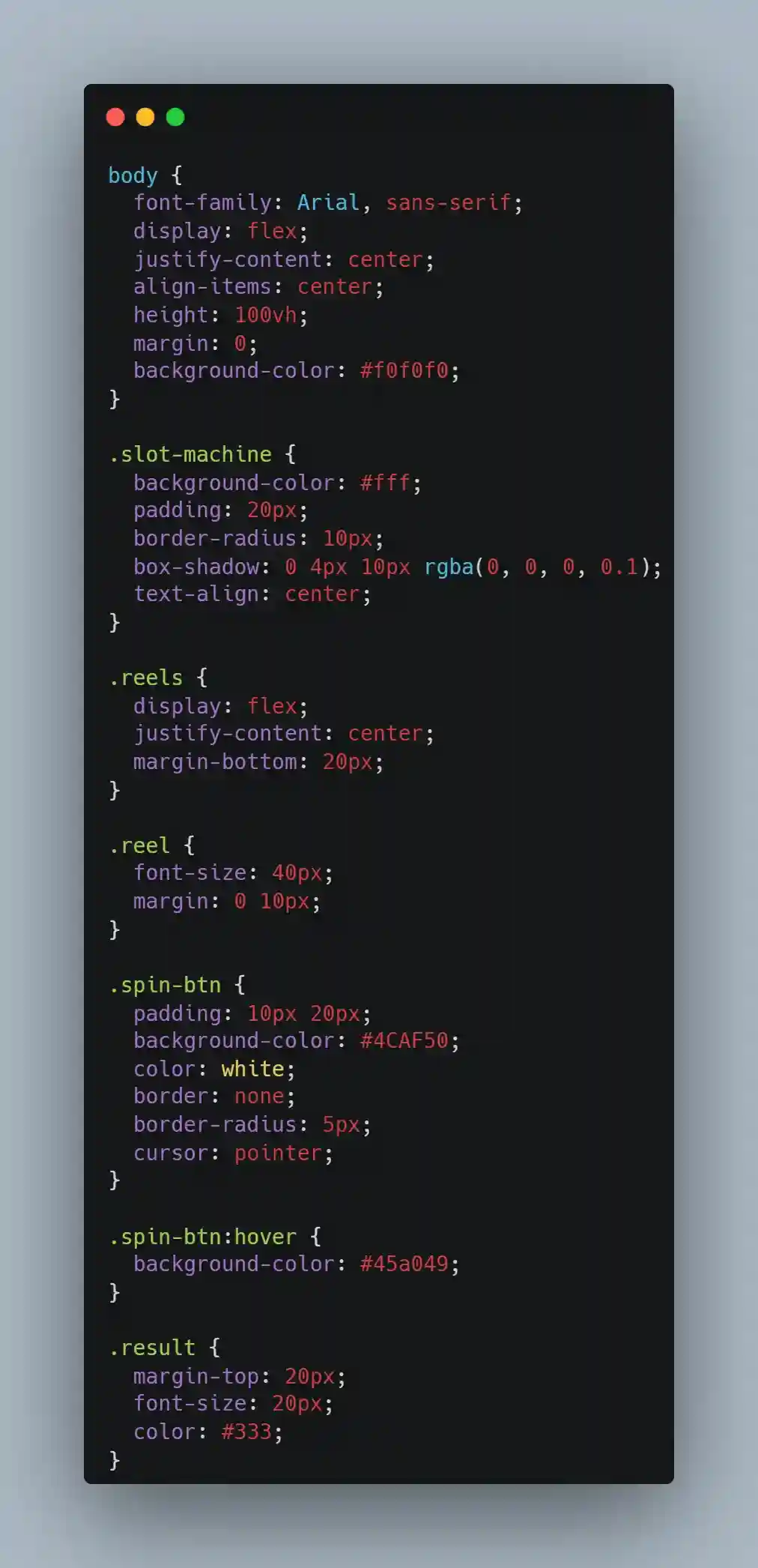
This CSS code ensures that the slot machine elements are styled with a clean and simple look. The .reels container uses flexbox to align the individual reel elements horizontally. The spin-btn is styled to be visually appealing, and the .result area will show the outcome of the spin.
2. Making the Layout Flexible
To make the slot machine responsive, we need to adjust the layout for different screen sizes. The simplest way to do this is by using flexbox to ensure the elements adjust based on the available screen space.
For example, let’s ensure that the reels and the spin button resize appropriately on smaller screens. You can set the font-size of the reels to be responsive by using relative units (such as vw or %):
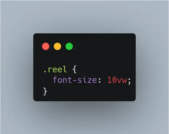
In this case, the size of the reel symbols will scale with the width of the viewport. This ensures that the slot machine elements are proportionally sized on all screen sizes.
3. Using Media Queries
To fine-tune the layout for specific screen sizes, we can use media queries. Let’s consider the following breakpoints:
- For screens wider than 600px (tablets and desktops), the default layout is used.
- For screens smaller than 600px (mobile devices), the layout will adjust to fit the smaller screen size.
Here’s how to implement these changes with media queries:
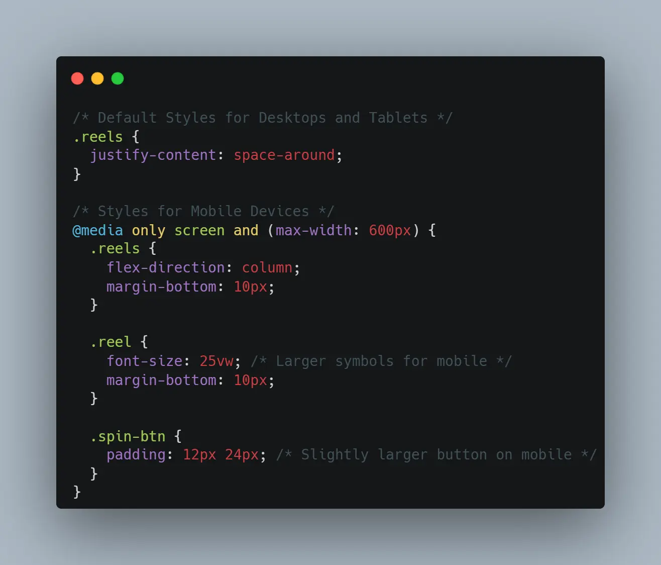
In the code above, for screens wider than 600px, the .reels container is displayed with its items spaced evenly. For smaller screens, we switch to a vertical layout (flex-direction: column) to make the reels stack on top of each other. The reel symbols are also resized using vw to make them larger on smaller screens, ensuring they remain legible.
4. Adjusting the Button and Result Area
To ensure the button and result area are properly adjusted for all screen sizes, we can also use media queries to tweak the button size and margin:
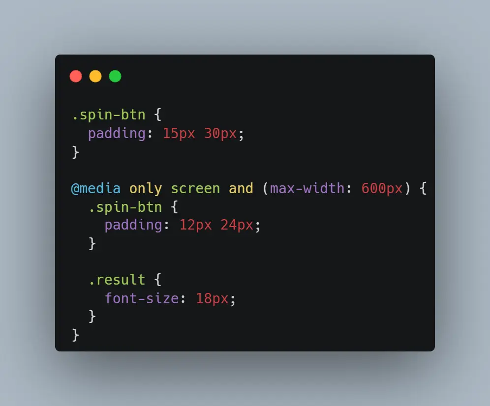
This ensures that the spin button is appropriately sized for different screen sizes and that the result area remains easy to read.
Testing and Debugging Responsiveness
Once you’ve made these changes, it's important to test your design on various devices and screen sizes to ensure that the layout behaves as expected. There are several ways you can test responsiveness:
- Developer Tools in Web Browsers: Most modern browsers have built-in tools that allow you to simulate different screen sizes. You can resize the viewport in Chrome, Firefox, or Edge by pressing F12 and selecting the responsive design mode.
- Real Devices: If possible, test your slot machine on real mobile devices, tablets, and desktops to ensure that it works as intended.
- Online Testing Tools: Tools like BrowserStack or Responsinator let you test how your website looks on various devices.
Additional Considerations for a Better User Experience
In addition to responsive design, there are other aspects of user experience to consider when creating a slot machine.
- Smooth Animations: Adding transitions or animations can make the experience more engaging. For instance, you can animate the reels spinning and stopping to give users a more realistic experience.
- Touch-Friendly Design: On mobile devices, ensure the slot machine buttons are large enough to be easily tapped. Adding padding and making buttons visually distinct can improve usability.
- Accessibility: Ensure that your slot machine is accessible by providing keyboard navigation options, using semantic HTML, and adding ARIA labels.
Make Your Slot Machine Perfect for Every Screen - Let’s Optimize It Together!
Conclusion
In this post, we've explored how to make your HTML slot machine responsive across different screen sizes. By using flexible layouts, media queries, and other responsive design techniques, you can ensure that your slot machine provides an optimal user experience on mobile, tablet, and desktop devices.
If you need assistance in making your web application or slot machine even more responsive or would like to implement additional features, AIS Technolabs is here to help. We specialize in custom web development and can work with you to optimize your designs for any screen size.
Feel free to contact us for more details or for professional assistance with your project!
Disclaimer
This blog is intended for informational and educational purposes only. We do not promote or facilitate gambling activities in any country where it is considered illegal. Our content is focused solely on providing knowledge about legal and regulated markets. We only work with operators and platforms that are licensed and comply with the laws of jurisdictions where casino gaming is permitted. We do not operate or endorse any form of gambling in restricted regions. In countries where only skill-based games are allowed, our involvement is strictly limited to those games.
We believe gambling should be an entertaining and responsible activity. Our goal is to ensure that the platforms we review uphold the highest standards of fairness, transparency, and player safety.
FAQs
Ans.
A responsive design ensures that your game appears and performs well on all devices, thus attaining more players and higher engagement.
Ans.
Use Chrome DevTools to test across all devices, or BrowserStack or real devices for deeper testing.
Ans.
You can use max-width: 100% and height: auto so that images are scaled within their containers on all screens.
Ans.
Absolutely. Most slot game players use touch devices; therefore, designing for touch input can contribute significantly to greater usability.

Mary Smith
Mary Smith excels in crafting technical and non-technical content, demonstrating precision and clarity. With careful attention to detail and a love for clear communication, she skillfully handles difficult topics, making them into interesting stories. Mary's versatility and expertise shine through her ability to produce compelling content across various domains, ensuring impactful storytelling that resonates with diverse audiences.
 ASIA PACIFIC